Chloe Rudd
|
|
|
|
|
1. For the art criticism process you first must describe the art, so you would basically explain what the art looks like. Next you would analyze the art work, meaning you explain the elements of the art work. Then you interpret the artwork, which is when you figure out what the mood or feeling is being conveyed by the artwork. Lastly you judge the artwork. What is your opinion of it and why?
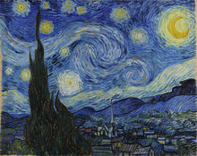
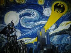
 2.-Is copying always plagiarism or is there a gray area? Explain your thoughts. I think that is depends on the circumstances. Most of the time they teach us in school that plagiarizing is stealing someones work and claiming it as your own, which is true, but copying is not always plagiarizing. I have seen many people recreate famous works of art such as Starry Night by Vincent van Gough, which is copying the original, but the artists are not claiming the idea as their own. Say some random person painted an exact replica of the Mona Lisa and claimed that it was an original piece of art, the would be plagiarizing, but if they painted an exact replica and then said that they were inspired by the Mona Lisa then that would be copying, which is okay in this case. -What are some reasons why artists make art? There are many reasons as to why artist make art, some make art to cope with life struggles, while others do it cause they have fun with it. Van Gough was locked up in a mental hospital when he painted starry night, his was of dealing with being crazy was to paint, all the time. This is not always the case though. I know many people who just like to draw, paint, and make pottery because its just what they like to do. Lots of artist do art to raise awareness about certain causes. Lots of people will hire artists to make art installations to show support of things they believe in. _What is the point of this class? What did you get out of it? While I am not so great at art, I took this class because I like drawing, painting, and sculpture. I believe that the point of this class is to teach us the basics of art, and in my case it helped me to prepare for future art classes at Apex High School. While in this class I can tell I improved my are a lot. Looking back at my first pencil drawing to my recent sketches, its crazy to see how much my art has changed even if it doesn't feel like it. 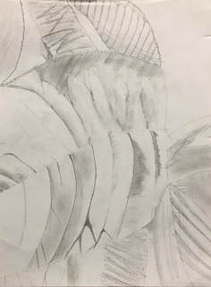 Art Critique 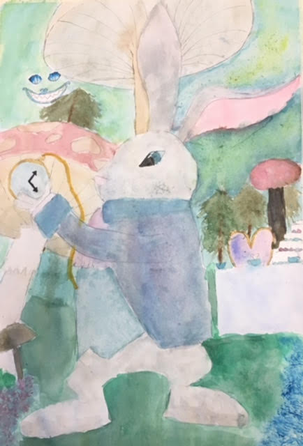 This piece of art looks very bright and multicolored. The colors are almost all in the cool color scheme with the exclusion of some pinks and dark reds, those being the ears and mushrooms. In the foreground we see a white rabbit wearing a waist coat and jacket, holding a golden pocket watch. In the background we see an assortment of mushrooms, trees and a tea party. In the upper left corner there is the face of The Cheshire Cat.
The lines in this art work are soft, rather then harsh, and all of the colors blend together to create a calming, mesmerizing look. There is a large variety in shapes and sizes of things in both the background, and the foreground. The watercolor paint style gives this piece the main pastel, but bright vibe. While the main focus of this piece is the rabbit, you cannot help but look at landscape which helps bring harmony to the piece. The mood of this piece, in my opinion is calming. When you look at you don't feel fear or sadness. The story in the piece is that The White Rabbit was checking his pocket watch, because he's always late, while there is a tea party going on behind him (which he is late for) and the Cheshire Cat is watching him. This piece of art is semi-successful, meaning that it turned out okay, but I would have changed some things. I would have loved to see more texture on the rabbit, using probably a dry brush technique, because he's looking really basic. I also would have changed the angle of his legs because they don't go with the angle of the rest of his body.
0 Comments
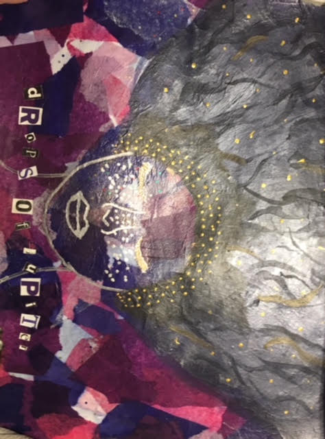 I used 5 techniques to create this mixed medium art piece. The first I used was tissue paper. The background in many shades of blue, pink, and purple, which was done by tearing tissue paper and pasting it down. The second medium I used was marker/sharpie. I used silver sharpie to draw the face and gold sharpie to add some details like dots in the hair and eyelashes. Then I used paint to add hair. I wanted her hair to have a semi-galaxy vibe so I mixed silver with blue, purple, and black creating a unique color. I later decided to cut out letters from magazines spelling out the lyrics from a song this art was based on. Lastly I added random glitters throughout the piece, which is subtle but you can see it in some places like the hair. My prompt was lyrics from a song you like so I chose the song Drops of Jupiter by Train, which is one of my all time favorites. 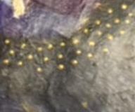 a (very blurry) up close of the hair line
 For my watercolor character I decided to recreate The White Rabbit from Alice in Wonderland. My design differs from other artists because I used my own imagination to create him. He does look a little bit like other renderings, but that is because in the book in describes him as a white rabbit in a waist coat. While creating this piece I struggled with colors bleeding into one another, paint lifting up and not being able to get the right shapes. I started with the background of the painting. I added mushrooms, because in Wonderland there are huge mushrooms and then I added a tea party, because the white rabbit is always at tea parties with his friends. I also added Cheshire Cat. The I painted White rabbit, starting with his fur and ending with his coat. 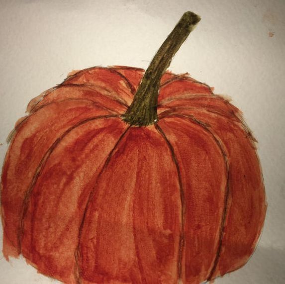 The watercolor painting I did of the pumpkin was most definitely the most helpful.
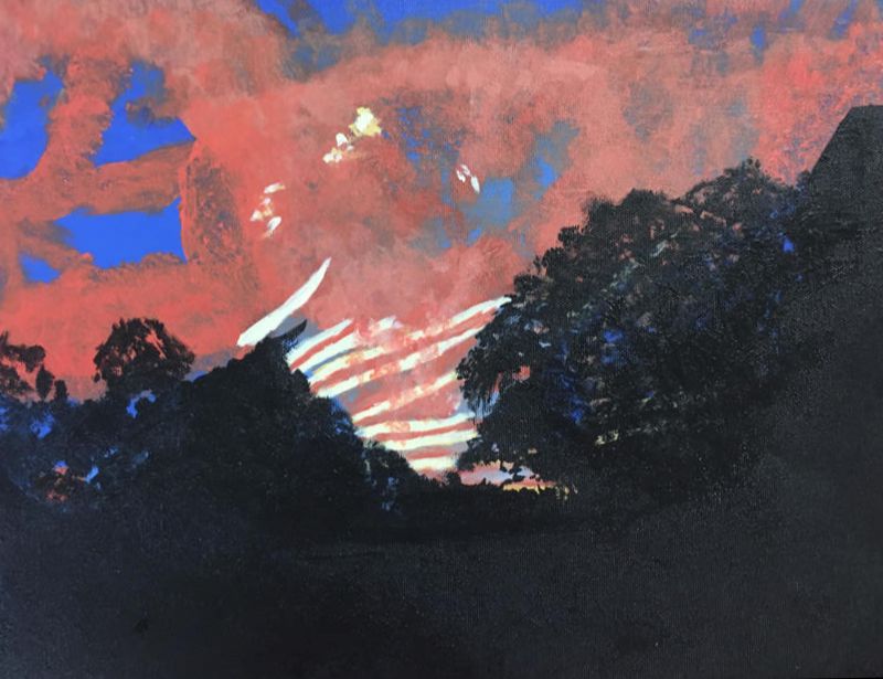 1. The place represented in my art is my best friend's lake house on Lake Gaston. This was taken over the trees in the backyard. This house is where all of our family friend circle goes for weeks at a time over the summer and we all go tubing on her speed boat and we have picnics on her pontoon boat. All of us just get together and bond. 2. The thing I found most challenging was the weird lines and shapes in the sunset. There were lots of diagonals, horizontals, and verticals all mixed together. I think that in the end it made it look more unique though. 3. Honestly, I don't think this is my best piece ever but the most successful part of it was probably the pink part of the sunset, near the right side. 4. I first sketched the general outlines and then got to work painting. I started with the blue ombre sky, which in the final piece you can't really see the ombre, I think it was needed in order to give the sky a more realistic look. I then added the pink in. The unique shapes of this made it difficult but I powered through. I then added the small yellow lines in which added a nice pop of color. And I finished off with the black silhouette of the trees. I ended up going over the trees with some blue and pink to add more yellow, and then I brought down the tree line a bit which helped make the black not so overwhelming because this piece is supposed to be very vibrant and bright, not dark. 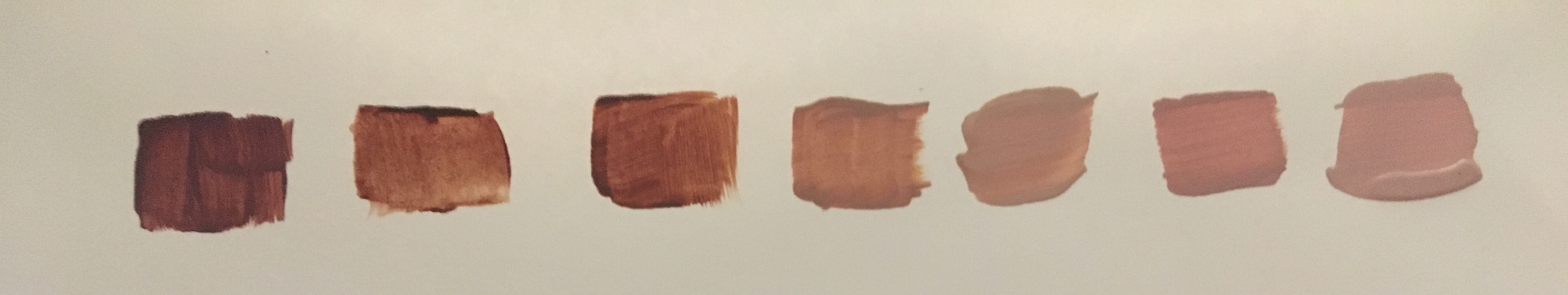 I think the skin color mixing was the most helpful because we had to work had to create hard-to-make colors with just red, blue, and yellow. I didn't end up using skin tones in my piece but they still helped me to mix the colors for my painting a lot better. I got almost perfect matches in paint to my original image.
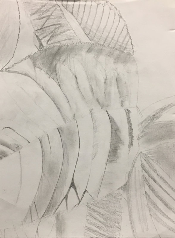
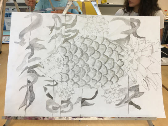 1. I chose to use pencil to draw my two in one because I thought that it would best suit the piece. They ways that I needed to shade, highlight, and add detail all worked with pencils the most. 2. I decided to add together a pineapple and a fish because I had never seen anything similar and when planning my ideas, I didn't even think about this combination until I noticed how easily you could turn a pineapple into a fish. 3. I first had to draw thumbnail sketches of all of my favorite combinations, my top three was a butterfly hot air balloon, a elephant butterfly and a pineapple fish. Upon looking around the room i saw that plenty of people were already doing an elephant butterfly and I just thought a pineapple fish was a fun idea so I stuck with it. I then began sketching out my piece in my sketch book, and once done I got to work on my main piece. I started with a silhouette of a pineapple, then I added the leaves, then the fish head, and finally the scales. After this the really hard part started. The shading and highlighting. I had to do each individual scale/spike and I took me a while to find a technique that I liked but once I found it I stuck with it. I went from really dark, to medium, back to dark and then to light again. The stem/fins were also really hard because I had a picture reference for the main stem but I had to freehand all the tiny fins, and pineapples have to many twisty turny leaves that it just gets really hard. Finally I got to the kelp in the back ground. I wasn't sure where exactly a pineapple fish might live but I assumed it would be with lots of other plants. I tried to make each piece of kelp unique by changing up the shades, but in retrospect I wish I had done the top part of the plant lighter and the bottom darker because then it would have looked like the sun was shining from up above.  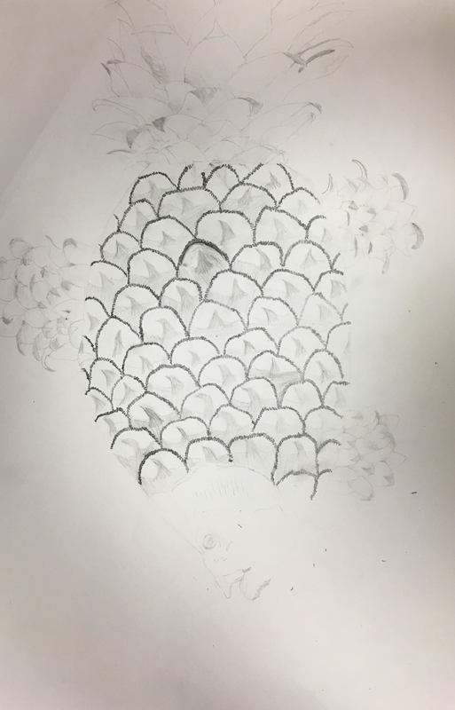 From this activity I learned how to make different colors using different amounts of the primary's. yellow, blue, and red. It's important to know how to make all these colors because when painting, it will help you to be able to make that perfect shade of whatever color you need.
To make brown, you mix different amounts of the primary's together to make different "shades" of brown. 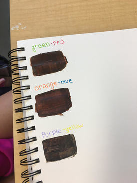 My mentor is Anna W. Her favorite medium to work in is mixed medium.
Blog Link: annaw-apex-2018.weebly.com I think I will greatly benefit from having a more experienced artist as my mentor. If I need help with a piece I am working on, I can simply ask them what they think I should add. I also think looking at their art will inspire me because they too started out where I am, a very inexperienced artist, and yet somehow they got a lot better over time. Value- The lightness or darkness of a color Composition- The placement or organization of visual elements
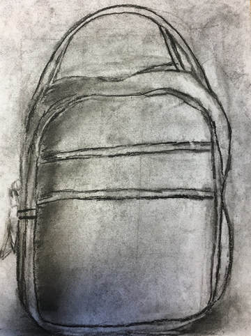 Pros or Charcoal- Charcoal is super easy to blend because it is really loose. The ability to easily layer allows you to add shadows and highlights. Another pro of charcoal is that if you make a mistake, you can simply wipe it away with a paper towel. Cons on Charcoal- Using charcoal does not at all help to add details in my opinion beause it is so dense. Charcoal is really, really messy and you are bound to smear it and get it all over your workspace and your hands. If you are like me and like to stay clean, charcoal is not for you... 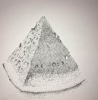 Pros of Pen- When using pen, because of the amount of detail you can do the drawings often turn out looking very photorealistic. You can easily put in extremely tiny details that you would be able to put in using pencil or charcoal. You can also easily add shadow by simply making the pen thicker in certain spots and you can add highlight by making the pen thinner. Cons of Pen- If you are looking to make a quick sketch, pen it not the tool to do it with, especially if you are doing stippling. It is extremely time consuming. 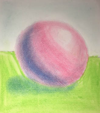 The spheres were definitely the most helpful, the helped me with my blending and layering techniques. While some of the different things we used to draw the spheres with were a little bit harder to blend, especially the colored pencils, but the techniques were very helpful in making my drawings better.
|
Author
Archives
January 2018
Categories |
 RSS Feed
