|
.
|
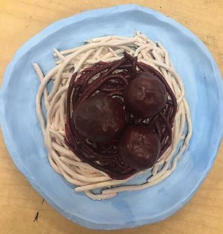
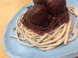
1. I think for the most part it is neat, the plate is a little wonky and the noodles are slightly uneven, but overall I think it could have been worse. If I was able to craft the spaghetti without the noodles constantly breaking I think they would have been a lot neater.
2. The most difficult part of this project was trying to make the plate neat. I just couldn't get all the sides not and round and I couldn't get it to be smooth, it turned out all lumpy.
3. I think the noodles and the sauce look good together, but the blue plate was not the best choice of colors. If I could go back I would have made the plate white or grey.
4. Yes I think it is. If you look at it from the side you can see all the different noodles and the meatballs, and if you look at it from any other angle you can see the same thing, but from another angle...
5. When you are making something out of clay you have to think of it from all possible angles, but you do not have to worry about shading and highlights because that happens naturally. When you are making something 2D you only have to worry about one angle, but then you also have to add shading and highlights which in my opinion is a pain.
6. Generally, spaghetti noodles are smooth so I did not really worry about texture on those, but meatballs are very texture-ful so I had to figure out a way to get the unique texture. To do this, I would get some really wet clay and smear it on the meatball and then tap it with my finger, which ended up giving me a pretty good texture. I would also take tiny balls of clay and squish them onto the meatball in order to give the slightly misshapen look.
7. In a way it does, but it also doesn't. The noodles are slightly too big, and the sauce is a little dark, but overall I think it looks fairly similar.
8. If I were to do this again I would take more time and be more careful when crafting each piece.
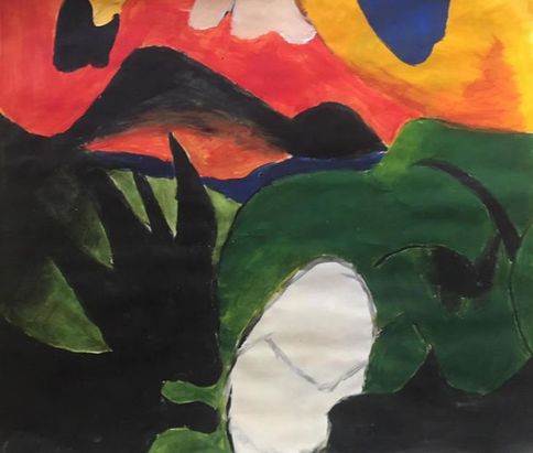
Out of the whole acrylic unit, this was by far my favorite painting. I think it turned out pretty good and all four pieces of the painting we did look really good together. I really got to practice a lot of techniques and blending. I really love the bright colors and bold shapes of this artist's style, it just all flows together nicely.
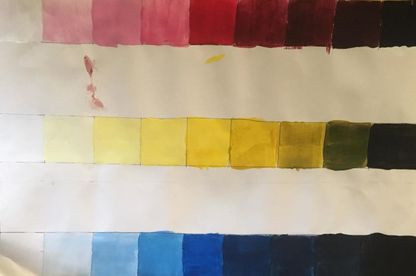
This activity was helpful in that I was able to make shades and tints of colors. I probably needed this because without it I wouldn't have known that a little black goes a long way and a lot of white goes a little way.
I think that this activity was helpful because it let me experiment with mixing colors together to make new colors. I also got to practice with certain techniques that I didn't get to use in my painting, so this was a good way to learn how to do them.
|
|
This was a useful activity because it really did help me with blending and shading, which was very useful in my self portrait. This turned out much better on the black paper, in my opinion, because I just think the colors look so much better together and overall is just looked better.
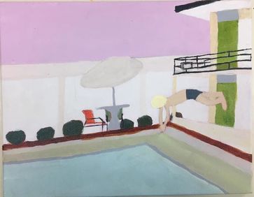
Diving into a Pool
1. The reference artist I used for my painting was David Hockney. I used
-A Bigger Splash
-Beverly Hills Housewife
-American Collectors
-Mr. and Mrs. Clark and Percy
2. I think the craftsman ship could have been a little but neater, for example, most of the lines are crooked, and the colors aren't exactly spot on, but I do think it could have been worse.
3. I thought this project was pretty easy, but for me I'd say it was trying to make straight lines because my hands are very shaky and just don't seem to like going in straight lines.
4. I chose to use dull colors because with the exception of a few, most of Hockney's paintings were flat and used dull colors.
5. Hockney painted lots of minimalist pool paintings, as well as some paintings with "minimalist" people, or people with not much detail. I think I did an okay job of channeling all his styles put together.
6. He would probably laugh a little and then say that I did a good job putting all his paintings together.
7. If I were to do this again I would try to make it a little bit neater and try to steady out my hand, I would have also tried to add a little bit more color to certain areas because it looks very bland.
|
|
David Hockney
David Hockney is one of the most influential pop art artists of the 20th century. Most of his painting consisted of bright colors and people, and a lot of times a pool. Sometimes Hockney would do paintings of landscapes using lots of bright greens, purples, oranges, and blues. His all time, most famous piece is a painting called A Bigger Splash, painted in 1967. When Hockney was invited to paint a portrait of The Queen, he turned it down saying he was too busy, and when he was offered knighthood, he turned that down as well. Eventually, Hockney was voted the most influential artist of all time.
After college, Hockney moved to Los Angeles, California where he would begin experimenting with Acrylic paint, which at the time was a new medium. LA inspired Hockney’s series of bright pool paintings.
Hockney has experimented with lots of different styles of art, including painting, photography, printmaking, and even technology such as art applications on the ipad. Although he is good at many styles, he always seems to go back to painting portraits. He would do portraits of anyone from his employees, to his boyfriends, but he has always loved doing self portraits, having painted over 300. Most of his artwork has been done in acrylic paint, but he has experimented with many mediums, as I said before, he loves “painting” on his ipad, and he also uses oil sometimes.
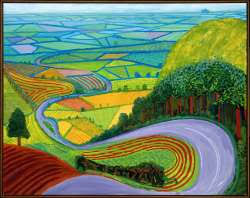
(Image 2) This painting is titled Garrowby Hill and was painted in the late 20th century, although the exact year is unknown, we do this painting comes from a series of paintings based in yorkshire. You can see a long road, winding through colorful fields, set in the Yorkshire countryside. While this painting bares a strong resemblance to the actual location that it is based, it is widely believed that this was done from memory.
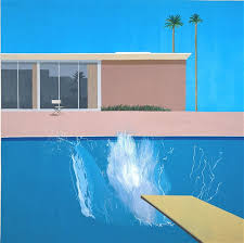
(Image 1) This painting is titled A Bigger Splash, and was painted in 1967 using acrylic paints. Set in California, the colors used in this painting are supposed to make it look dry and hot. You can see a modern house with a single chair in front, and then a diving board with a pool and a big splash happening.
Works Cited
Anirudh. “David Hockney | 10 Facts About the Famous British Artist.” Learnodo Newtonic, 3 Apr. 2015, learnodo-newtonic.com/david-hockney-facts.
“Bigger Splash.” David Hockney Paintings, Prints & Artwork | Unofficial Fansite, www.david-hockney.org/bigger-splash/.
“David Hockney Biography, Art, and Analysis of Works.” The Art Story, www.theartstory.org/artist-hockney-david.htm.
“Garrowby Hill.” David Hockney Paintings, Prints & Artwork | Unofficial Fansite, www.david-hockney.org/garrowby-hill/.
“Garrowby Hill.” David Hockney Paintings, Prints & Artwork | Unofficial Fansite, www.david-hockney.org/garrowby-hill/.
David Hockney is one of the most influential pop art artists of the 20th century. Most of his painting consisted of bright colors and people, and a lot of times a pool. Sometimes Hockney would do paintings of landscapes using lots of bright greens, purples, oranges, and blues. His all time, most famous piece is a painting called A Bigger Splash, painted in 1967. When Hockney was invited to paint a portrait of The Queen, he turned it down saying he was too busy, and when he was offered knighthood, he turned that down as well. Eventually, Hockney was voted the most influential artist of all time.
After college, Hockney moved to Los Angeles, California where he would begin experimenting with Acrylic paint, which at the time was a new medium. LA inspired Hockney’s series of bright pool paintings.
Hockney has experimented with lots of different styles of art, including painting, photography, printmaking, and even technology such as art applications on the ipad. Although he is good at many styles, he always seems to go back to painting portraits. He would do portraits of anyone from his employees, to his boyfriends, but he has always loved doing self portraits, having painted over 300. Most of his artwork has been done in acrylic paint, but he has experimented with many mediums, as I said before, he loves “painting” on his ipad, and he also uses oil sometimes.
(Image 2) This painting is titled Garrowby Hill and was painted in the late 20th century, although the exact year is unknown, we do this painting comes from a series of paintings based in yorkshire. You can see a long road, winding through colorful fields, set in the Yorkshire countryside. While this painting bares a strong resemblance to the actual location that it is based, it is widely believed that this was done from memory.
(Image 1) This painting is titled A Bigger Splash, and was painted in 1967 using acrylic paints. Set in California, the colors used in this painting are supposed to make it look dry and hot. You can see a modern house with a single chair in front, and then a diving board with a pool and a big splash happening.
Works Cited
Anirudh. “David Hockney | 10 Facts About the Famous British Artist.” Learnodo Newtonic, 3 Apr. 2015, learnodo-newtonic.com/david-hockney-facts.
“Bigger Splash.” David Hockney Paintings, Prints & Artwork | Unofficial Fansite, www.david-hockney.org/bigger-splash/.
“David Hockney Biography, Art, and Analysis of Works.” The Art Story, www.theartstory.org/artist-hockney-david.htm.
“Garrowby Hill.” David Hockney Paintings, Prints & Artwork | Unofficial Fansite, www.david-hockney.org/garrowby-hill/.
“Garrowby Hill.” David Hockney Paintings, Prints & Artwork | Unofficial Fansite, www.david-hockney.org/garrowby-hill/.
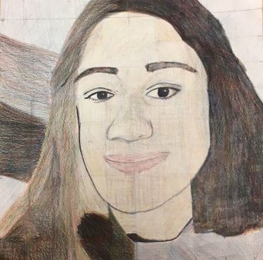
1. The craftsman ship of this drawing was not very good and the drawing overall was just not that well executed. Pretty much everything about this drawing was off.
2. I think I did fine blending my colors and picking the right ones, but I was lacking in shading and highlights. It's really flat overall. I am not sure why I didn't add more shading because looking back at my original image, it seems like pretty east shading.
3. I did in some areas, but in most areas I just gave up. I definitely think that if I did it the right way it would have turned out a lot better overall. Everything is just kind of out of proportion, and I think doing it the right way would have fixed it.
4. This drawing is really flat and there isn't much value change overall. But where there is value change, I would just push down a little harder with the pencil, I used this to create the darks and lights in my hair mostly.
5. To get the colors I wanted, I would blend ore of some colors and less of others. To get skin tone, I used very, very light yellow and red, with very minimal blue. I used the equal parts of yellow, red, and blue to create the dark part of my hair.
6. I think that if I just completely redrew the drawing and recolored it, it would be a lot better. Knowing what I know now, I think I could make it look 100 times better.
7. I don't think I have a lot of drawing skills, so I wasn't really that prepared, but I think all the smaller activities definitely helped out a lot.
8. I think that Tori's piece was excellent, She used her colors provided wonderfully. and her overall piece looks really good.
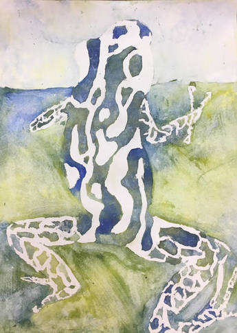
1. To create this painting, I started with a sketch based off a picture. I then covered the parts of the picture I wanted to stay white with masking fluid. I then poured watercolor. I decided to use the colors green, blue, and yellow because I thought it would suit the picture best. I then dried the paint and added another layer of masking fluid over the part I wanted to have the least amount of paint. I then poured more watercolor. I repeated putting on more masking fluid, this time in the place I wanted to have a medium amount of paint. I then added more paint to make the part with no masking fluid, making it the darkest area.
2. I struggled with the masking fluid peeling off when I accidentally out more on top. I also struggled with the water and paint pooling creating large spots of on color.
3.This project has taught me many things. For example, I learnt how to use masking fluid and how to remove it. I also learnt that this was a easier, more fun way to make watercolor paintings. This has taught me how to choose where I drop the colors and how to make them go where I want.
4. If I were to do this project again, I would have made it more detailed and depending on the circumstances, I would have chosen more colors and I would have made sure the paper was absolutely flat, to prevent pooling.
5. I used layers of paint to show different aspects of the painting, for example, the frog is the darkest piece of the painting to make him stand out the most. I used color to show that this was in a forest or a jungle.
6. I do not think they were useful in this particular painting, because this was essentially just dropping colors on the paper.
7. Yes! I think it was a very positive experience. This was a really fun project to do and I think having a guest artist come in and help us was a great experience.
8. From the guest artist, I learnt this whole new technique that I never knew existed. I also thought it was cool that he could do what he loves and make money off of it.
Watercolor Cherries
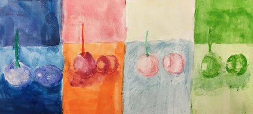
I liked some aspects of this project, but did not like some. I liked the section with the cool colors and warm colors, but I really struggled the watercolor pencils and the one color monochromatic. The pencils weren't blending as I wanted them to, and at first I had trouble with the monochromatic because the color wouldn't build up. Other than that I think I turned out okay.
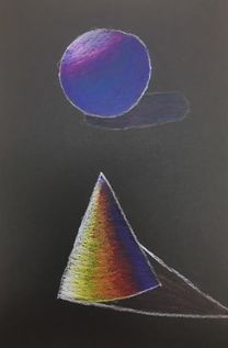
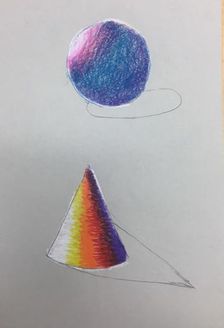
Watercolor Shading
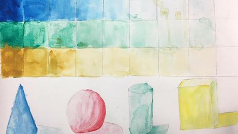
I thought that this painting was really helpful because I was having trouble with shading, but I figured out how to make colors the shade I wanted and how to blend together darks and lights. I struggled shading on the sphere and cube, but I think the cone turned out pretty good.
Watercolor Pumpkin
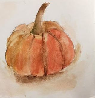
This was my favorite watercolor painting, besides the one with the masking fluid. I just like shading with watercolor because it always turns out nice. While this isn't my best work of art, I still like it. I struggled with the shape of the pumpkin, as you can tell it looks a little misshapen.
Water Color Techniques
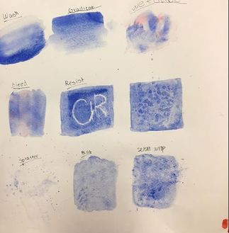
I thought this was really useful, it helped me with multiple techniques I used in later watercolor paintings. Most of these techniques were really cool looking, but I had trouble with some. Not because they were hard, but because the paper would warp and the color would run. I especially had trouble with the wet on wet because the colors were going every which way. My favorite technique was the gradient, the whole aesthetic of it was really nice.
|
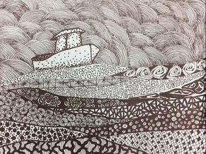
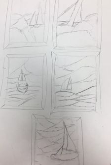
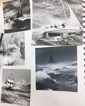
1. I decided to put an emphasis on the water and the boat, and less of an emphasis on the sky. I did this by putting on small pattern in the sky, and multiple larger patterns in the water, drawing your attention to the sea, rather than the sky. I think this was successful.
2. Pattern and texture are important in this drawing because it adds more detail that I would have been unable to obtain if I was trying to draw a realistic scene. I could separate the waves showing choppy water, and make the sky look darker by knitting the pattern together tightly. 3. Value is important in this drawing because I could make the sky darker, making it stormy, and by adding shading in between each shape, I could show that those are different parts of the sky, like separate clouds. I also shaded the boat using stippling to show that the bottom of the boat is in the water. 4. I think the project is crafter okay. There weren't many patterns I could use to represent water to I started to use random patterns which turned out not bad, but I think it could have been better. I also which I had done some type of simple pattern on the boat. All in all I think I could have done worse, but I also think I could have done better. 5. Practicing helped me with my project because it helped me learn how to make smaller, steadier patterns and lines. I also came up with some patterns while practicing. 6. It is important to use techniques learned in class, and to understand the concepts we learned because they help with making your pieces look more aesthetically pleasing and organized. 7. I think the techniques I learnt from this project will help me in the future because it helped me learn how to make tiny and steadier details. 8. If I could redo my project, I think I would of done daintier, flowy patterns in the water to add to the calming aesthetic. I also would have added more detail and pattern to the boat. |
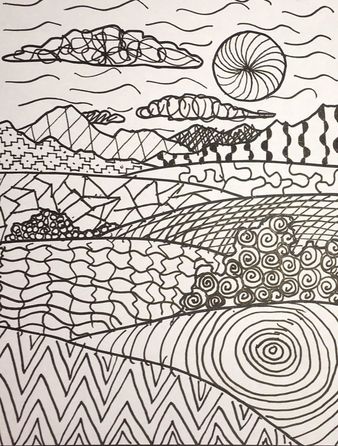
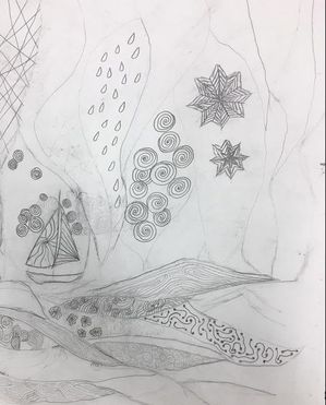
Landscape Patterns
I thought this activity was really fun. The way you can make patterns into pictures is really cool. It was tricky to figure out what patterns to put where, but in the end I think it turned out pretty good.
I thought this activity was really fun. The way you can make patterns into pictures is really cool. It was tricky to figure out what patterns to put where, but in the end I think it turned out pretty good.
|
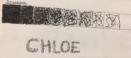
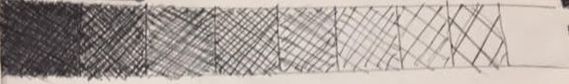
Pen and Ink Textures
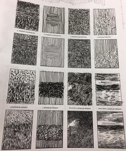
Although these were pretty hard and tedious, they were kinda of fun. I think that some of them had some weird shapes but all in all they weren't that bad.
|
|
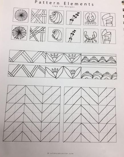
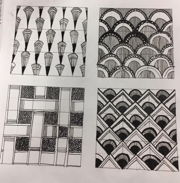
Pattern Elements
|
|

|
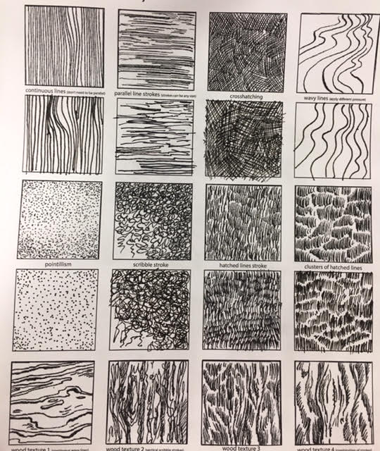
Most of these were pretty easy but the crossed one on the second work sheet was pretty tricky, causing me to mess up multiple times.
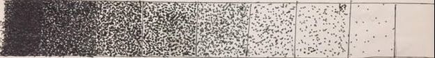
Stippling technique
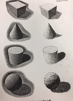
While stippling mostly turns out looking pretty good, it is very tedious and irritating. The hardest part was the areas where it was very dark because as soon as you think you're done, you have to make it darker.
|
Pen And Ink
|
|
First Day Of School Art
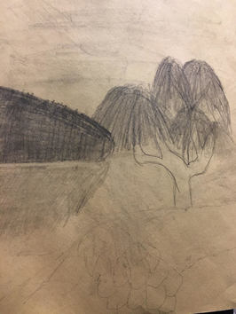
The tree in landscape was very hard for me to draw, as I am not great at drawing nature. I redrew this at least 6 times. I used a reference of a tree with a silhouette of trees in the background. This was hard for me to do because I struggle with texture and detail when it is far away.
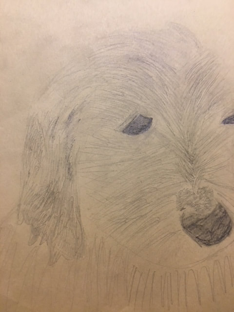
For my animal drawing, I decided to draw my dog when he was a puppy. I struggled with this one as well, I drew this multiple times and I found every time I have ever tried to draw an animal, I was unsatisfied with the results. As I said before, I struggle with texture, in this case texture being fur.
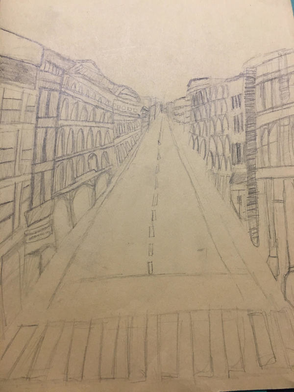
Before drawing this scene, I had never done a perspective drawing before, and I found that I really liked doing it. The angles were a little complicated to get down and I still don't quite get most of them. I was also unsure how to shade, but for my first perspective I don't think this turned out as bad as it could've!
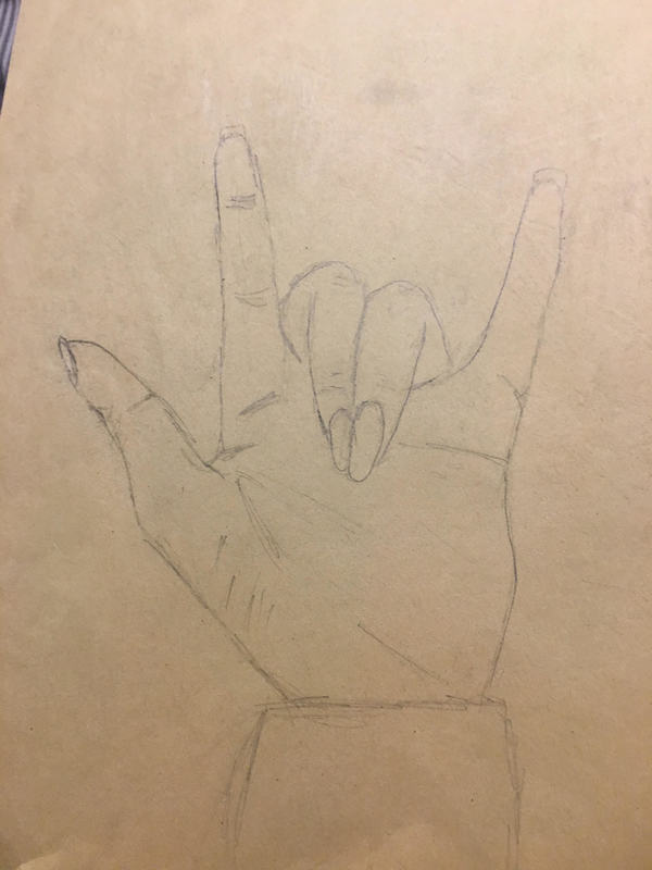
I has TONS of practice with hands in art 1, so I am not too bad at them. To draw a hand I make the shape with my own hand and just copy that. I hardly struggled with this at all. I kind of like drawing hands because it's gotten so easy.
