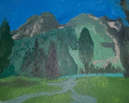
As my reference I chose to use a picture of Wyoming that my friend took. It is very safe to say that my painting does not represent the picture very well. I had never done a palette knife painting before so I was unsure of good techniques. I think I could improve a lot and it was pretty fun to do so I might try another one in the future. I also had trouble with the colors because I ran out of white near the end. I also had a lot of trouble figuring gout how to add details. If I were to do this again I would probably make sure I had enough paint and I would figure out how to make it look more realistic.
|
|
|
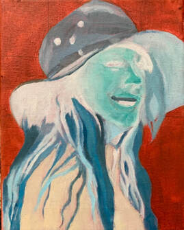
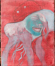
When thinking about what to do for this project, I was thinking about how I could play with colors. Seeing as I had never used oil paint before I wanted to use every cool looking colors that I might not be able to use otherwise. So I decided on doing invert colors. I used an app to switch the colors around to help me out. I chose this picture as reference because I felt like there was lots of depth in my hair and the shadows were very dark, well in invert they were light I guess. One of my main issues with this projects was trying to do the face. I have never tried to paint a face so this was a first for me and I think the only place to go from here is up. I also had a hard time mixing the right colors. If I were to do this project again I would probably try to add more detail to the face.
|
|
|
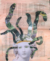
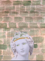
For this project, I wanted to go for something like medusa. If you know the story behind Medusa, you would know she was beautiful but was turned into a monster. I wanted to channel some of that beauty in that flowers and the garden as well as in the gold headband on the sculpture. I chose to take a more of a collage looking mixed media approach and I think it ended up looking pretty cool. The softness of the sculpture and background combined with the harshness of the magazine cutouts creates a nice contrast. One of the main issues I had with this was the watercolor on the pages bleeding through. Another issue I had is that I can't find the book with the finished product in it. If I were to do this project again I think I would make the bricks look more like bricks and I would try to add some more detail to the pages.
|
|
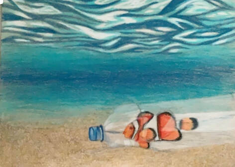
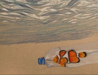
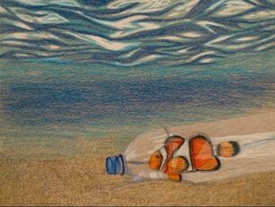
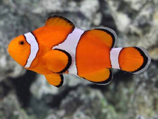
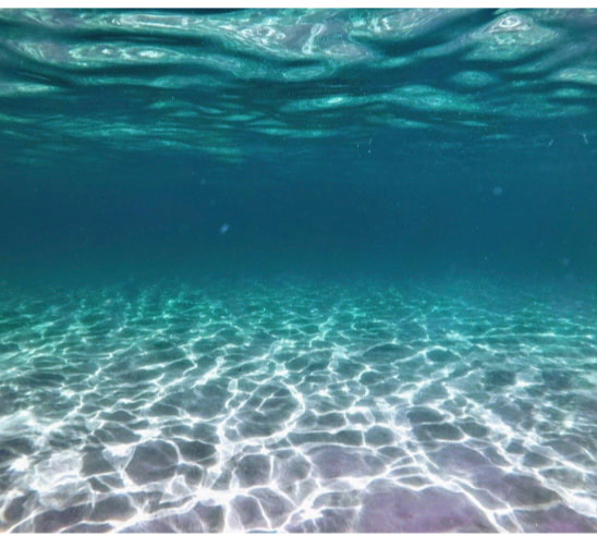
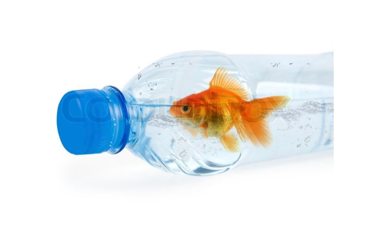
For this project, I wasn't really interested in anything in my house so I started thinking about what I would be able to draw that reflects, both literally and physically something that I think is important which is why I chose to do ocean pollution. I chose to represent this by putting a fish trapped in a plastic bottle. It took me a while to figure out what fish I was going to do because originally I was thinking of a goldfish but that wouldn't make sense seeing as goldfish aren't in the ocean, then I thought beta but that wouldn't work for the same reasons, so I then settled on a clownfish because not only is it vibrant but I felt like since it was in Finding Nemo people would have more sympathy in a way. I wanted to pick a pretty fish because I wanted to represent how beautiful the ocean is and how it is getting destroyed by pollution. The most difficult part of this project was trying to figure out how to draw the water without just coloring the background blue. I found a really good reference picture that showed depth and looked really pretty so I decided to go with it and try my best to create something similar. In the end I wish that I had blended the background more with the top because it looks kind of incomplete and blocky. I think if I did this again the water bottle would probably look much better along with the sand.
|
|
|
|

|
