Required Question
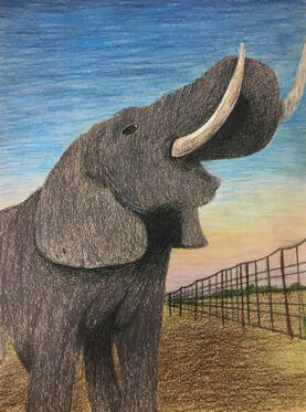
While thinking of ideas for this project, I was trying to think of something that someone else in the class wouldn't do. I knew I wanted to do an Animal, but I wasn't sure which animal I wanted. After looking on Pinterest for a while, I decided on an elephant. I looked everywhere to find the perfect angle and none of them were really working. When I thought I had finally found an okay picture, Mrs. Rossi called me over and showed me a picture of her friends daughter alongside an elephant, and it was perfect. When I started sketching it out, I had to figure out the angles and how to make it look proportioned correctly because the angle it was at made it a little tricky. Planning out the colors was a little weird because in the sketch I just used greys and later on I ended up using blue and purples as well in my final. When I started on my final, I kept sketching and re-sketching every part in order to get it perfect. When I started coloring it, I started with the tusks, and I had to make the dirty looking, which was tricky, and I ended up using very light yellows and tans, and in the end a white gel pen to add highlights. I had a lot of trouble with the shading around the neck area, because I didn't know how to make it as dark as it needed to be without making it look shapeless. I ended up using the shadows from the ears to add definition around the neck if that makes sense. Elephants are very wrinkly, and I had to figure out the shading and highlights for those as well. I layered, and layered until I got them to a point where I liked them. I also had a little but of trouble with the trunk, because I had to make it look like it didn't just disappear into the mouth, and I think in the end I achieved that. When I colored the sky, I used tons of layering in order to create an ombre effect. I used at least 12 different colors, and a blending pencil. It turned out to be almost wispy in a way. The fence was pretty easy, it was just basic one point perspective.
While thinking of ideas for this project, I was trying to think of something that someone else in the class wouldn't do. I knew I wanted to do an Animal, but I wasn't sure which animal I wanted. After looking on Pinterest for a while, I decided on an elephant. I looked everywhere to find the perfect angle and none of them were really working. When I thought I had finally found an okay picture, Mrs. Rossi called me over and showed me a picture of her friends daughter alongside an elephant, and it was perfect. When I started sketching it out, I had to figure out the angles and how to make it look proportioned correctly because the angle it was at made it a little tricky. Planning out the colors was a little weird because in the sketch I just used greys and later on I ended up using blue and purples as well in my final. When I started on my final, I kept sketching and re-sketching every part in order to get it perfect. When I started coloring it, I started with the tusks, and I had to make the dirty looking, which was tricky, and I ended up using very light yellows and tans, and in the end a white gel pen to add highlights. I had a lot of trouble with the shading around the neck area, because I didn't know how to make it as dark as it needed to be without making it look shapeless. I ended up using the shadows from the ears to add definition around the neck if that makes sense. Elephants are very wrinkly, and I had to figure out the shading and highlights for those as well. I layered, and layered until I got them to a point where I liked them. I also had a little but of trouble with the trunk, because I had to make it look like it didn't just disappear into the mouth, and I think in the end I achieved that. When I colored the sky, I used tons of layering in order to create an ombre effect. I used at least 12 different colors, and a blending pencil. It turned out to be almost wispy in a way. The fence was pretty easy, it was just basic one point perspective.
1. My artistic style ranges from realistic, to more creative. I like using colors and creating something that looks real like you could reach out and touch it, but I also like creating patterns and making weird looking things. I think as an artist, you are successful when you have created a piece that you are satisfied with, and that you cannot improve. The most rewarding thing is when you finish a piece and it turns out how you wanted. The most significant thing I learned is that you have to take your time and layer, it will make it look better in time.
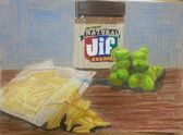
2. I really think Kaitlyn's opacity drawing was good. She used colored pencil. It looked photo realistic and I think the best part was the peanut butter jar. She used shading and highlights in order to make the jar look round, and she layered a bunch in order to make it so there was no paper showing through, and it made it look so good. She struggled with the chips and grapes, and the plastic bag was out of her comfort zone, but I think they both turned out looking a lot like the picture.
https://kaitlynrosenahs20.weebly.com/drawing.html
https://kaitlynrosenahs20.weebly.com/drawing.html
3. My favorite medium was colored pencil. I got so much better at it from this class, and I really like how artwork using it turns out. I was able to get better from all the practice we did, especially the fruits and vegetables. The people around me helped as well by watching them and by them telling me how to improve myself. I do not think I have mastered this yet, but with a few more years of practice, I think I could get much better.
4. I felt the least successful in my self portrait. I think if I had done a different idea it would have looked more like me, or a person for that matter. You cannot tell what is what. For example, you cannot tell there are sunflowers in the background at all. If I could do this piece again, I would do it in colored pencil so you would be able to tell what it is. I would also take more time on the background and try to add more definition. I also would have not rearranged the strips as much as I did.
